
Peloton has made several small updates to its fitness platform over the past year, but there is still plenty of unmet potential. Below is a wishlist of 10 updates that I believe would make the Peloton significantly better.
Table of contents
Peloton update video
🚴♂️ Thanks to VeloQuip Dual Bike Fans for sponsoring this video.
(Use code WATTS5 for 5% off.)
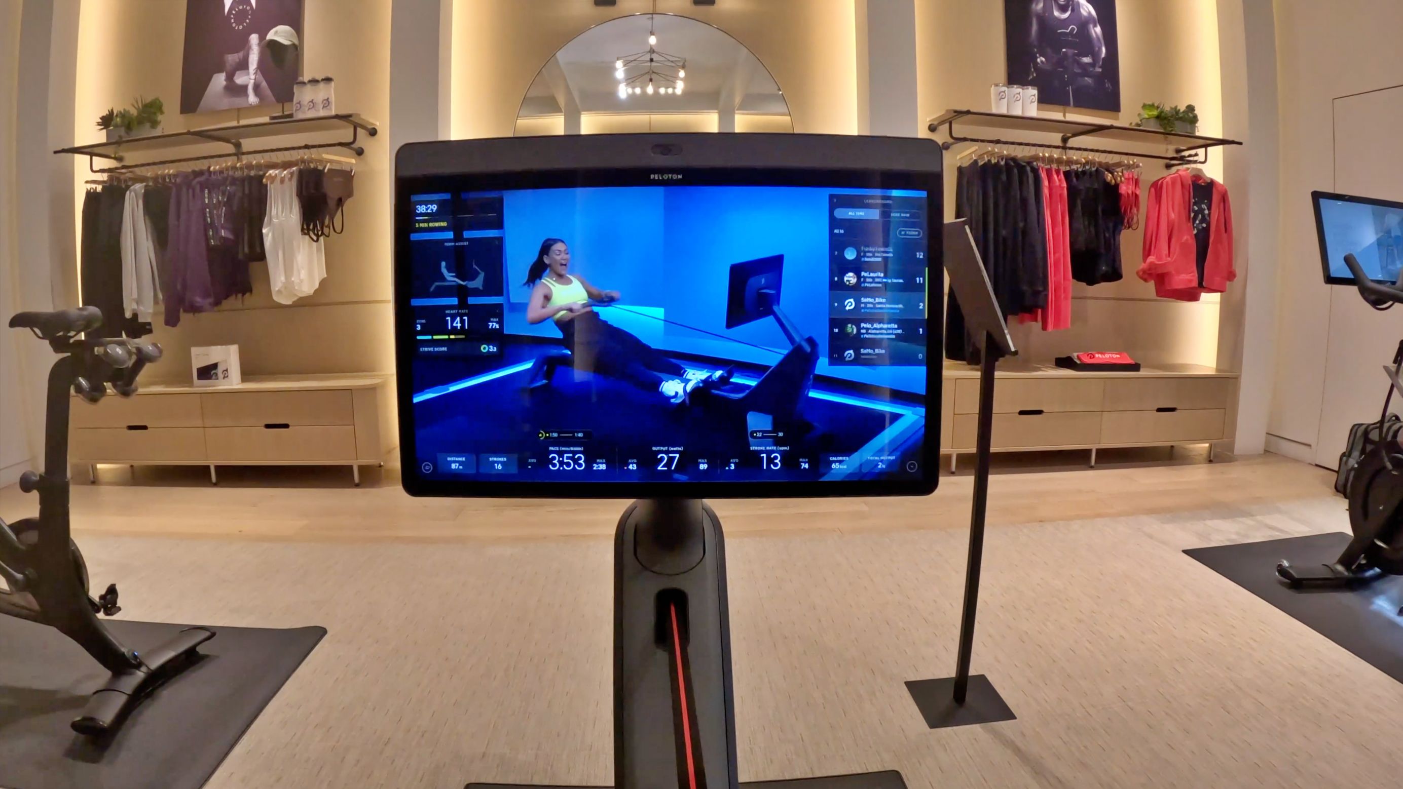
1. Peloton rowing classes
Look, I get what Peloton is trying to do with equipment exclusivity. They don’t want a bunch of Peloton members buying other rowers. However, I think this exclusivity has done more harm than good.
For one, I think most Peloton owners would agree that a $44/month “All-Access Membership” should give members… all access.
Secondly, I think this has also been a bad financial decision for Peloton. Peloton has not sold a huge amount of rowers. And the ones they have sold have mostly been to current members who already pay for a membership.
At the same time, there are likely already close to a million Concept 2 rowers in homes around the world. If Peloton would allow digital members to upgrade to an all-access membership and provide these rowing classes, that opens up a potential for a huge new audience, some of which may fall in love with the brand and want to buy a bike or treadmill.
2. Power Zone Guidance
Peloton seems to prefer putting out a variety of content and leaving it up to the individual how to best put it all together. This has its benefits in terms of community building but not in terms of results.
One thing Peloton does with strength training (on the Peloton Guide) is it selects a few classes each week to be a part of a weekly playlist – a playlist designed to help members create some structure in their training. I would love to see them do this for all other modalities but, most of all, for their Power Zone classes.
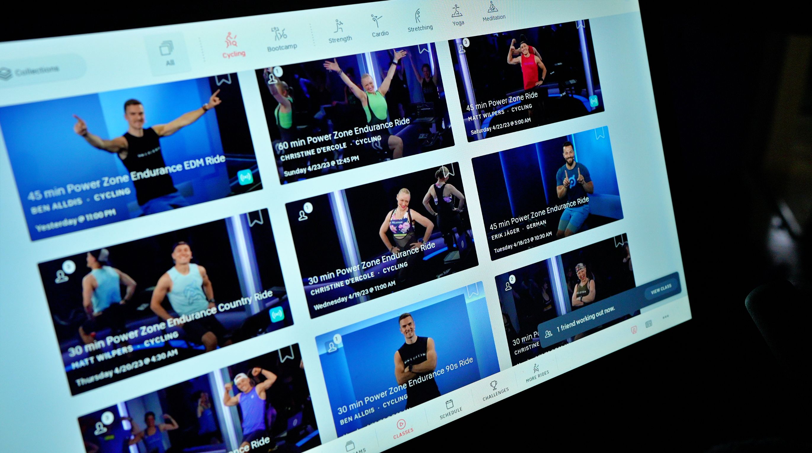
3. More Power Zone
I am obviously a big fan of Peloton’s Power Zone Program. In fact, for me, it is the primary reason I prefer the Peloton bike over other options. So, of course, I would like to see Power Zone training added to the Peloton Tread and Peloton Row. Without a Power Zone option, Peloton’s other equipment does not offer the kind of content that I would be interested in regularly viewing.

4. Peloton Tread workouts
Digging more into the workout options on the Peloton Tread, I don’t understand what the thought process is here. Currently, Peloton offers mostly higher-intensity classes with very few lower-intensity options.
The problem is no runners train this way.
Almost all runners spend the vast majority of training time on lower-intensity sessions. This leaves many Peloton Tread owners having to completely ignore whatever the instructor says.
One argument I’ve seen against adding more lower-intensity classes is that those classes cannot be as fun and entertaining. However, that does not hold up, given that iFIT on NordicTrack seems to have figured it out. It is for this reason alone I rarely suggest to my running friends that they consider Peloton.
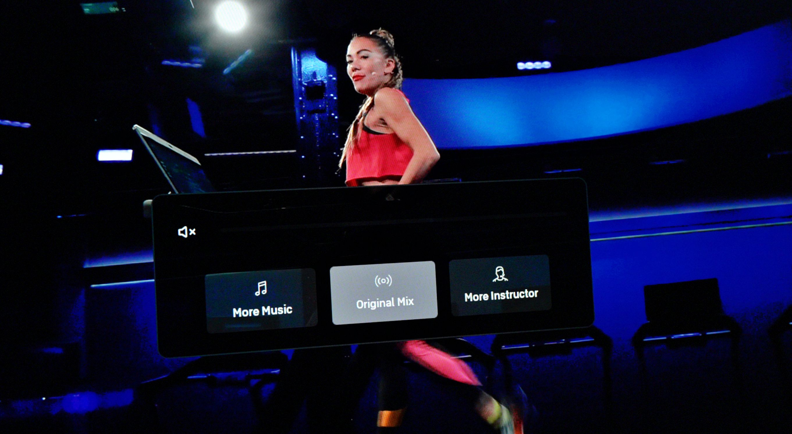
5. Adding Netflix
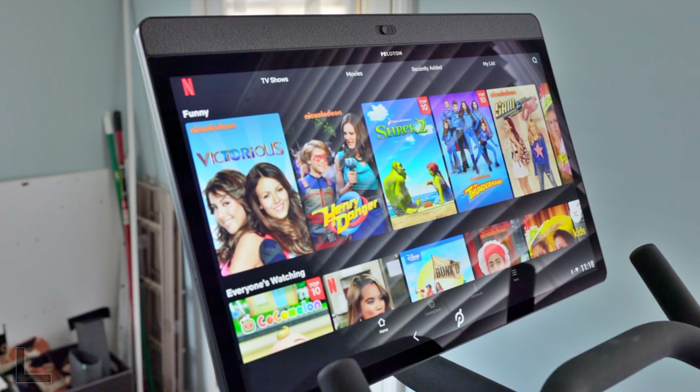
Or at least, Peloton could give members an option to entertain themselves for lower-intensity sessions by allowing access to other apps like Netflix.
It seems a bit absurd at this point, given how many members want the option to be able to stream Netflix, that Peloton still seems set on never entertaining the idea. We have a video on how to add Netflix to Peloton with a Mac, but it’s not easy, given how hard Peloton fights to not allow this.
6. Fixing Lanebreak
As a lifetime gamer, I would love to be able and enjoy Lanebreak on the Peloton Bike. Unfortunately, while there is the start of what could be a very fun game, Peloton never went the extra mile to make it great.
So, Peloton, if you are out there, here are a few ways that could make Lanebreak more fun and popular:
- Add weekly challenges that members could complete for points.
- Those points could be saved to purchase new skins to replace the floating tire. I’m thinking a Jess Sims “Glazed Donut” would fit in nicely here.
- Allow members to earn new backgrounds or even exclusive classes by playing Lanebreak.
- Above all else, make it multiplayer. Or at least allow us to see “ghosts” and scores of our friends while riding.
These are just a few ideas, but there are hundreds of ways to improve Lanebreak so that members actually want to play it.

7. Stretching classes
Speaking of missed potential, let’s discuss the current state of Peloton’s stretching classes.
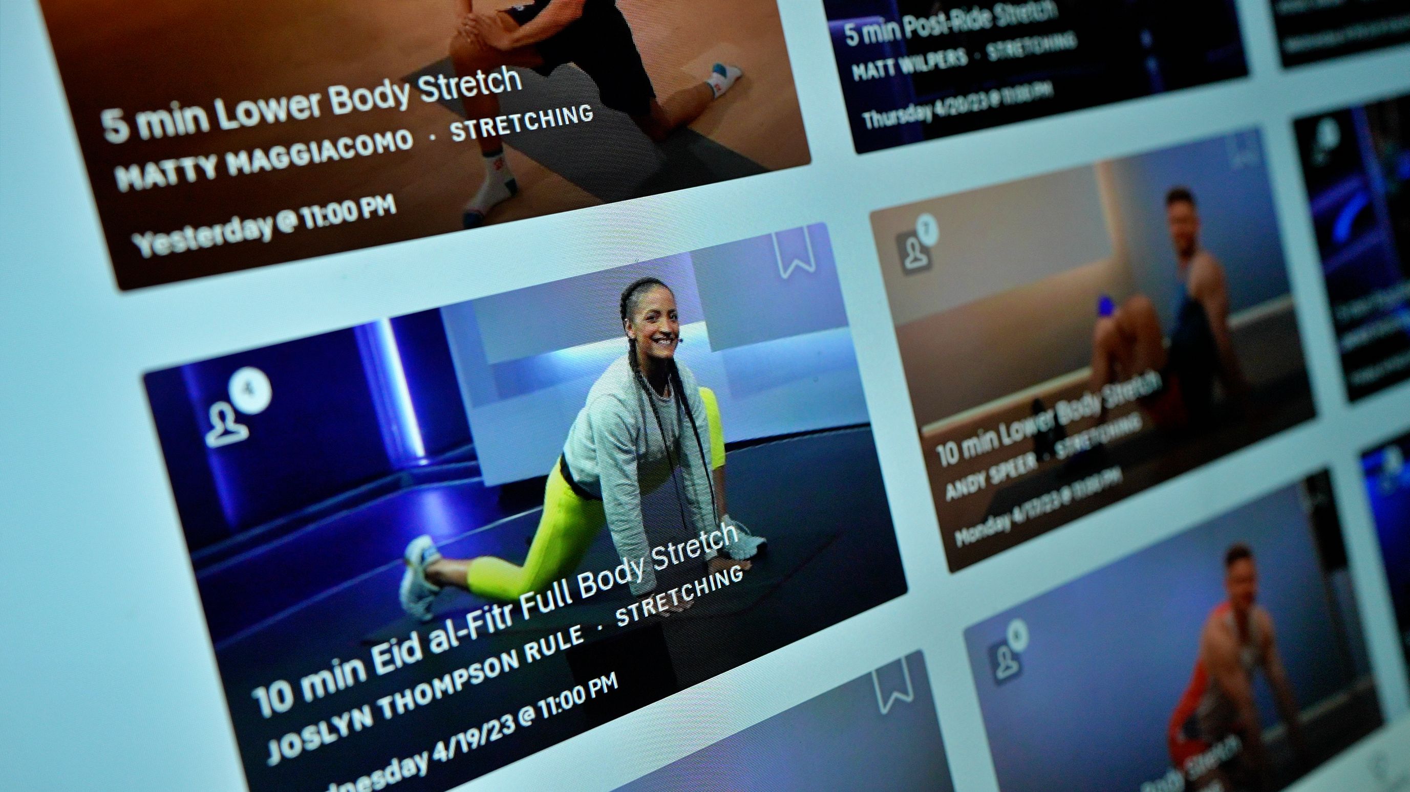
There are plenty of pre- and post-ride and run options available, which I think are well done. What is missing is good quality, longer mobility sessions. Peloton does provide these, but in terms of quality, they are easily the worst classes Peloton has to offer.
My biggest issue here is that stretches rarely ever go beyond a minute (if that), quickly moving from one stretch to the next. No position is ever held long enough to produce lasting, meaningful improvements to mobility. This is a shame because instead of taking the opportunity to improve its members’ mobility, Peloton seems to care more that no one gets bored.
8. Strive Score
Next up, we have the Strive Score, which was Peloton’s attempt to make heart rate tracking more meaningful. Ironically, the Strive Score in its current state is meaningless.
Strive Score converts the time spent in each heart rate zone into a score. What can you do with this score? No one has figured that out.
When it was first released, I figured it was a start to something that they would flesh out later on. But two years later, I am still waiting.

9. Strength class interface
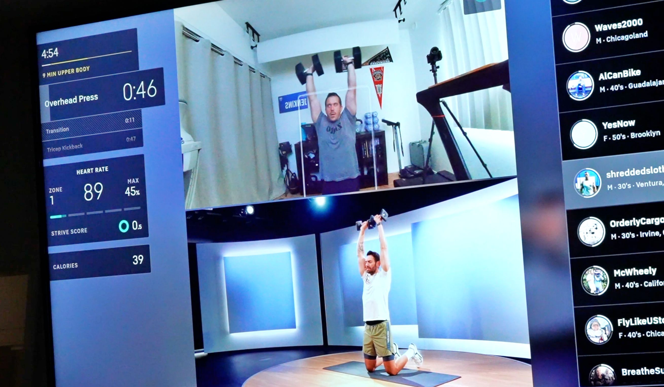
When the Peloton Guide was released, its best feature was not the movement tracking but the vastly superior graphical interface, an interface that not only shows members how long they have left for each movement but also the ability to see what movements are coming up next.
At this point, there is no reason that this improved interface should be restricted to only the Peloton Guide. All members should be able to benefit from it.
10. Improved watch integration
Finally, I would love to see Peloton focus on better watch integration, mostly in regard to outdoor workouts. Peloton has already added support for outdoor activities on the phone app, so allowing this on the watch app does not seem to be a big stretch.
Even better, it would be great to see Peloton partner with some of the bigger sports watch brands, like Garmin. Peloton could either make dedicated apps for those watches or even allow them to export workouts directly to the Peloton app, thus removing the need to always use the battery-sucking Peloton phone app while running or biking.
What else am I missing? Let us know in the comments below what improvements you’d like to see Peloton make.
FTC: We use income earning auto affiliate links. More.


